BA (Hons) Graphic Design & Illustration
What is visual literacy?
Visual literacy is being able to identify how and what an image communicates to the audience and what different questions we should ask to fully gain an understanding of the meaning.
Images and Questions:
Comparison between Uncle Sam Range and East Africa Transport Old Style' and 'East African Transport New Style
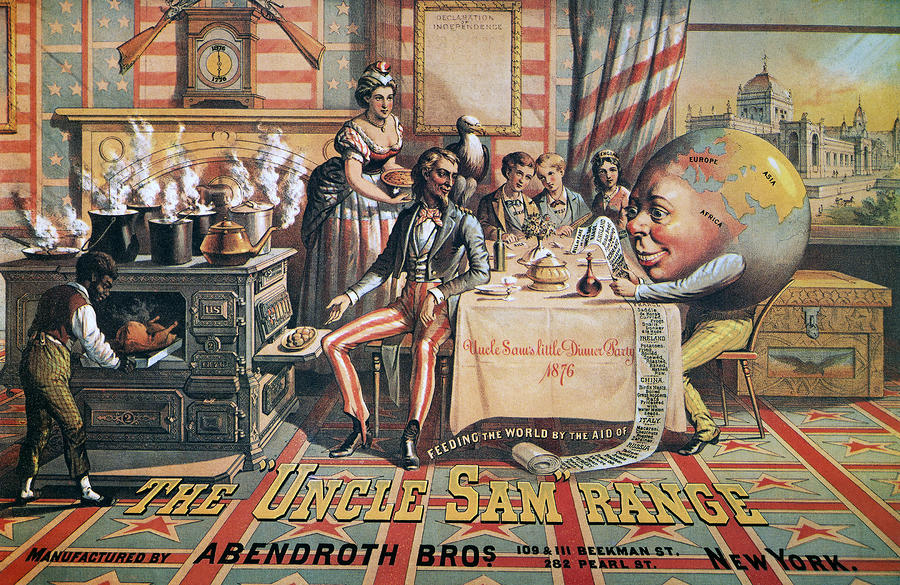
The Uncle Sam Range (1876) Advertising Image by Schumacher & Ettlinger, New York
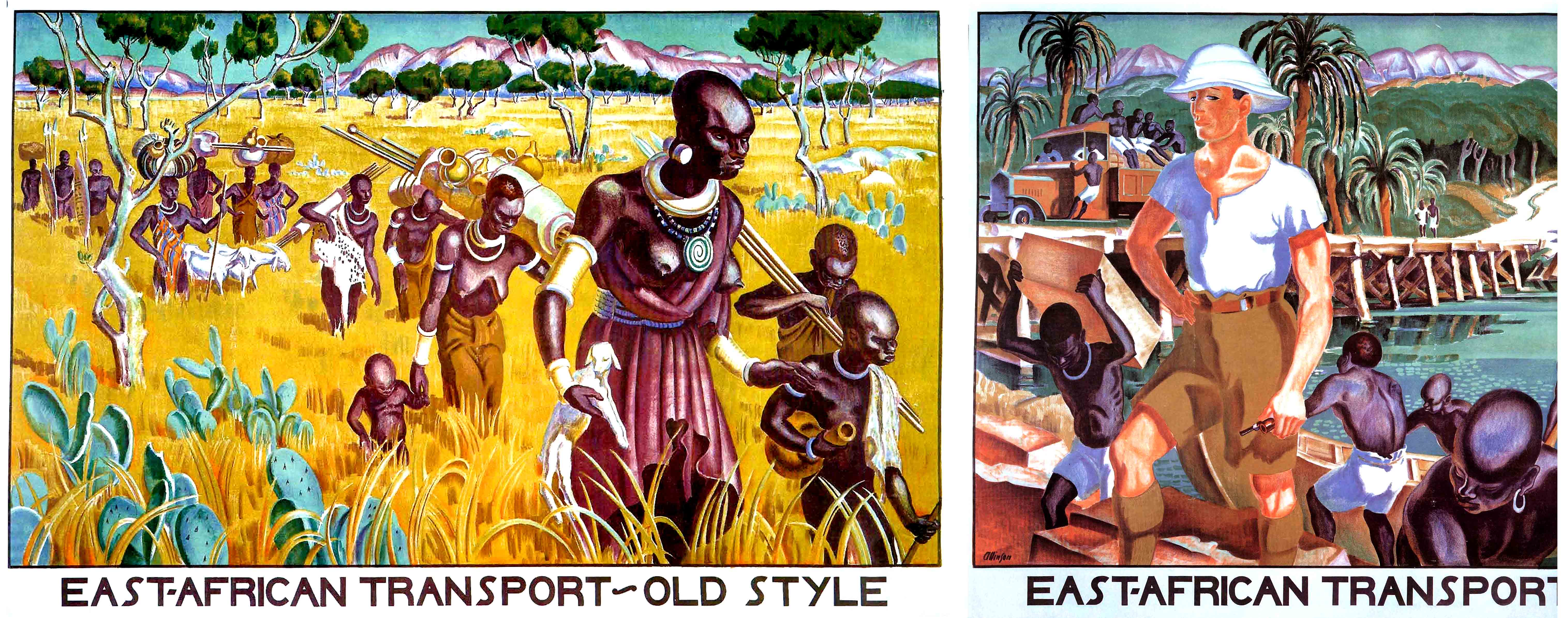
Empire Marketing Board - 'East Africa Transport Old Style' and 'East African Transport New Style' - Adrian Allison, from the 'Colonial Progress Brings Home Prosperity' Series of posters;
The thing that was most notable when I first looked at this image was how illustrative it is as piece of advertising/propaganda in comparison to what we might now.
Its evident that from the patriarchal colour choices of red white and blue and the western styled font that this piece was used to appeal to an american audience.
There are several pieces of evidence that suggest that this advert is intended to sell a cooker, we know this by the black man near the stove and people recieving the food and enjoying it, the words 'feeding the world in the aid of' suggest that they are trying to provide food for everyone and be seen as a positive force. I think the image is obviously quite materialistic because of this. The most profitable audience for materialistic items isn't specific to a certain class, however with the people of power and the amount of wealth suggested in the image it might be trying to appeal to people in the working class and possibly admiring the lifestyle and emulating wealth making them want to buy the product.
Although this image was seen as a positive marketing scheme for the time, I can't help but feel it has an exploitive feel to it, with the use of stereotypes on the long list of items, the black man (very likely a slave) is over the stove preparing the food for everyone and yet the stove is meant to be the product that is being sold, this could possibly show the normality of slavery at the time and the lack of progression in society around race. Another detail that is interesting to question is the role of gender, we can see a woman serving the people gathered around the table also showing another aspect of society that was different to what it is now and also gives us an insight to how progressive the times were.
The cartoonish globe stands out against the rest of the images's style as the rest is quite serious looking and and illustrative, the globe looks like its smiling against towards the list of food while everyone looks fondly over to it as well, this presents the idea that this image is meant to positively viewed.


The style of these pieces is of art deco graphics, we know this by the type face and the style of the images, both depicting the effects of colonisation in Africa, the images where made in the early 1930's . It presents a time where the Empire Marketing Board was put into place to by the British government in 1926 and colonial empires made up a huge part of the economy, so when criticism arose around the moral and economic issues of this organisation, many artists where given the task of providing work that persuaded its citizens of the 'positive' effects of the empire in different ways, one of these being through this piece of art.
The first image labeled 'East African transport old style' shows a group of women and children wearing traditional clothing and traveling and carrying various items by foot through an African landscape, whereas the second image contrast with it, there are still african people doing manual labour but they aren't any women and children and rather men instead wearing shorts rather than the traditional clothing and the landscape is much more urban with the use of a boat whereas before it was much more rural, put together these show a much different scenery and its desgined to show the positive effects of western culture taking over various countries, we know this by the depiction of a whire man standing proudly above everyone else as to show him possibly guiding everyone to a 'better' future.
Bibliography:
Graphic Design: A new history
https://books.google.co.uk/books?id=Kmx6qBz_l68C&pg=PA179&lpg=PA179&dq=East+African+Transport+Old+Style%27+and+%27East+African+Transport+New+Style%27&source=bl&ots=yqBnDyIvsM&sig=fuCWdduVL_KxZDEIA1e4SseRV_c&hl=en&sa=X&ved=0CEIQ6AEwCGoVChMI4Izyn6GwyAIVgvMeCh3mwwBI#v=onepage&q=East%20African%20Transport%20Old%20Style'%20and%20'East%20African%20Transport%20New%20Style'&f=false


