When looking at an example of media in terms of gender David Gauntlett references the film 'click' as an example, the film has been described as featuring both 'gross' humour but also a number of arguably touching moments. When looking at gender roles Gaunlett states that 'Clicks' protagonist isn't 'conventionally masculine' character from the focus of the narrative revolving around strong family values and emotions, however this could be contradictory as this same character uses his fictionally acquired abilities to his own advantage of means of pleasure which involves the objectification of women.
Leading characters within film show us the standard equality being presented in media, Gaunlett states that although there is a balance in terms of ability there is an obvious imbalance with conferring those roles into film, this is proven as there is evidence that proves there to be more male roles given over women's, as well as this the typical stereotypical concreted roles are still imposed within the context of roles,
Gaunlett refers to actors like Harrison Ford, Sean Connery, Michael Douglass and Bruce Willis as examples of how men are given a much more positive treatment in media in terms of age representation with men as they are allowed to be older and still remaining successful in hollywood roles, maintaining the stereotypical hero figure while women are required to be attractive and older women's roles remain as the most underrepresented in film to date.
In contemporary advertising sexism isn't always obvious, however Gauntlett observes that outdated gender roles are still utillised as a legitimate technique in current media and have been used as recently as 2007, it remains unclear where a male equivalent of this seems to be in modern society.
Gaunlett evidences the imbalance of gender in his observation of modern advertising and the presentation of women, what was shown is that they were more likely to appear in domestic product commercials compared to men, although this doesn't revel the complete context of the commercial, as in the nature of the role, it presents us with the evidence that there is a lack of change within representation, looking at culture and attitudes towards gender in general the data remains irregular as little growth as little been shown.
Although Gauntlett thinks obvious stereotypes aren't seen as much in the current media he addresses a definite deception in the medias portrayal of women, following the significant change between the 70's and 90's there seemed to have been no real change since. Women now are often expected to be shown being confident, attractive, and and a 'kitchen slave' to no one although this seens positive Gauntlett uses Macdonald's quote around the change in the late 80's and 90's and and how advertisers created a sense of illusion of a non sexist society this benefited branding, and by the 90's liberation and 'freedom' were no longer used to fight against the patriarchy were now doing so within beauty products.
When discussing selling beauty Gauntlett questions the amount of focus that researchers tend have on gender in terms of advertising in comparison to other selling techniques, as there are much more focus on things like tv as with ads we only see for a much shorter time span. But makeup and advertising have a close coupling as capitalists have produced the content to highlight insecurities and then sell things to 'fix' them.
Germain Greers talks about the amount of spending and the message that beauty advertisements conveys to its customers "the beauty industry takes 8.9 million out of women's pockets" Greer goes on to state the fact that magazines are funded by the beauty industry and as a result teach young girls how much they need makeup and how its used, establishing a life long struggle of a reliance on beauty products. Since Greer's 'The Female Ennuch' written in the 60's she believes things have gotten worse, and women are now 'infected' with the idea of perfection.
However this issue doesn't just effect women as Greer points out that its an issue with people. In 'the new feminism' by Natasha Walter (1998) looks at a survey that suggests that men may have more body image issues compared to women and notes that we're often too quick too assume that only women have to deal with these beauty standards.
However Greer thinks that women face much more pressure within their makeup and clothing, although, however Walter states that many people derive pleasure from the use of beauty products and fashion and refuses to see the advertising as a conspiracy.
A study from the university of Glasgow from 2001 revealed that women were ten times more likely to be unhappy with their bodies than men, the author of this Carol Emise stated 'Images are still of very thin women are desirable body shapes, there is still an association that beautiful women are thin and for men the images are more varied'.
Another study from 2003 showed that Hargreaves and Tiggerman asked teenage boys between the ages of 13-15 to list their top ten characteristics which they would choose in a partner, interestingly what came as the top results were 'personality' and 'sense of humor' and a 'slim figure' low on the list.
Greer observes that magazines aimed towards female readers featured a slimmer model whereas when aimed towards men the models were a lot curvier. Whatever level of weight is shown it definitely has an impact.
When it comes to emerging sexualities on tv, the lgbtq community have remained hidden for a long time, even as recent as 1990 even the sight of a gay couple prompted homophobic behaviour from viewers. One of the first tv shows to feature gay characters was an Australian series in the 70s, unfortunetly it later axed its gay characters for its american development, there were also the accosianal stereotypical characters. The 70s saw little growth of lgbtq representation, but when moving into the 80's there were gay characters in television but without any intimacy shown at all, gay characters still remained scarce. The 90's saw change in this as lesbians became more visible, in as in Britain there featured an intimate relationship on a main stream soap, this hopefully dispelling stereotypes and ignorance.
Wednesday, December 30, 2015
Tuesday, November 3, 2015
Study Task 3 - Reading and Understanding a Text
David Gauntlett - Media, Gender and Identity
Representation of gender today
Tone of voice:
My perception of tone of the voice within this piece is that its quite informal, although the language is moderately sophisticated, with the differing varieties of opinions aids the piece in having a casual tone of voice when addressing the reader.
Key Points:
- Society has an inequality of its views beauty and perceptions of specifically women in media
- The attitude towards advertising and its influences in selling to a certain gender
- The beauty industry is biased against gender and as a whole is often seen as a negative thing
- Attitudes towards different sexualities in media and the acceptance and tolerance that society has shown over the years
- There is a lack of representation with diversity and an imbalance within gender roles and and the nature of those roles
Key quotes:
- 'representations of gender in movies may have certain predictable trends but are quite diverse. Any critic or theorist who tries to suggest that films are all the same in terms of gender representation is simplifying to the point of meaningless'
- 'Some advertising is unapologetically sexist and is presumably used because its felt that the message 'works' for the target audience even if it might surprise and offend some others'
- 'Gender relationships shown in adverts may usually seem equal however content analysis still finds uneven numbers of men and women'
- 'Every woman knows that regardless of her other achievements she is a failure if she is not beautiful, the UK beauty industry takes £8.9 billion out of women's pockets, magazines funded by the beauty industry teach little girls they need makeup and train them to use it so establishing their life long reliance on beauty products'
- 'Its a pressure that our culture puts on people these days but its not just limited to women'
Wednesday, October 14, 2015
Study Task 01 - Image analysis
Context of Practice Task 1 Image Analysis Exercise
BA (Hons) Graphic Design & Illustration
What is visual literacy?
Visual literacy is being able to identify how and what an image communicates to the audience and what different questions we should ask to fully gain an understanding of the meaning.
Images and Questions:
Comparison between Uncle Sam Range and East Africa Transport Old Style' and 'East African Transport New Style
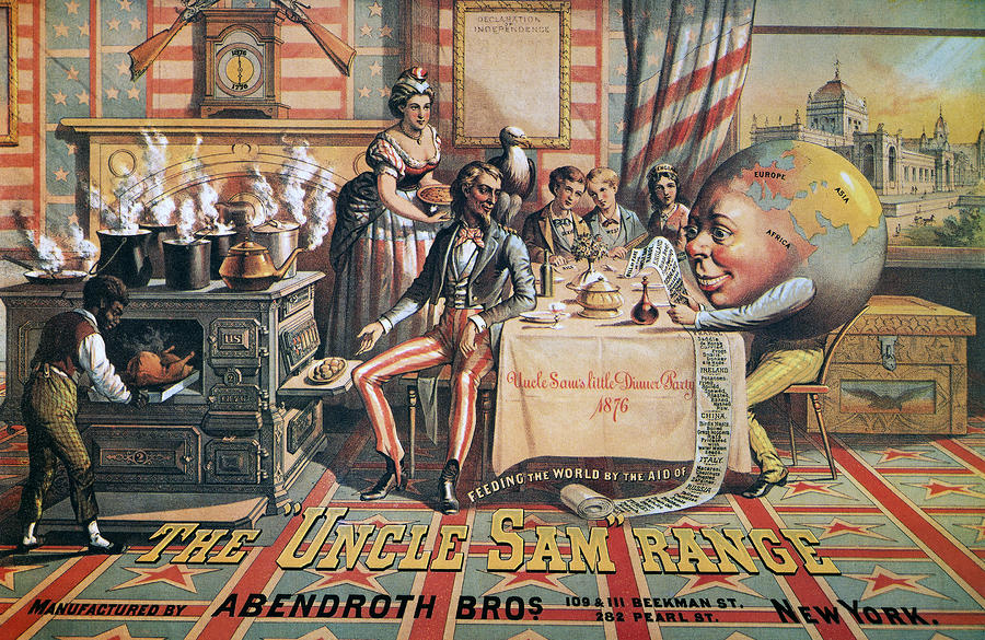
The Uncle Sam Range (1876) Advertising Image by Schumacher & Ettlinger, New York
Empire Marketing Board - 'East Africa Transport Old Style' and 'East African Transport New Style' - Adrian Allison, from the 'Colonial Progress Brings Home Prosperity' Series of posters;
The thing that was most notable when I first looked at this image was how illustrative it is as piece of advertising/propaganda in comparison to what we might now.
Its evident that from the patriarchal colour choices of red white and blue and the western styled font that this piece was used to appeal to an american audience.
There are several pieces of evidence that suggest that this advert is intended to sell a cooker, we know this by the black man near the stove and people recieving the food and enjoying it, the words 'feeding the world in the aid of' suggest that they are trying to provide food for everyone and be seen as a positive force. I think the image is obviously quite materialistic because of this. The most profitable audience for materialistic items isn't specific to a certain class, however with the people of power and the amount of wealth suggested in the image it might be trying to appeal to people in the working class and possibly admiring the lifestyle and emulating wealth making them want to buy the product.
Although this image was seen as a positive marketing scheme for the time, I can't help but feel it has an exploitive feel to it, with the use of stereotypes on the long list of items, the black man (very likely a slave) is over the stove preparing the food for everyone and yet the stove is meant to be the product that is being sold, this could possibly show the normality of slavery at the time and the lack of progression in society around race. Another detail that is interesting to question is the role of gender, we can see a woman serving the people gathered around the table also showing another aspect of society that was different to what it is now and also gives us an insight to how progressive the times were.
The cartoonish globe stands out against the rest of the images's style as the rest is quite serious looking and and illustrative, the globe looks like its smiling against towards the list of food while everyone looks fondly over to it as well, this presents the idea that this image is meant to positively viewed.
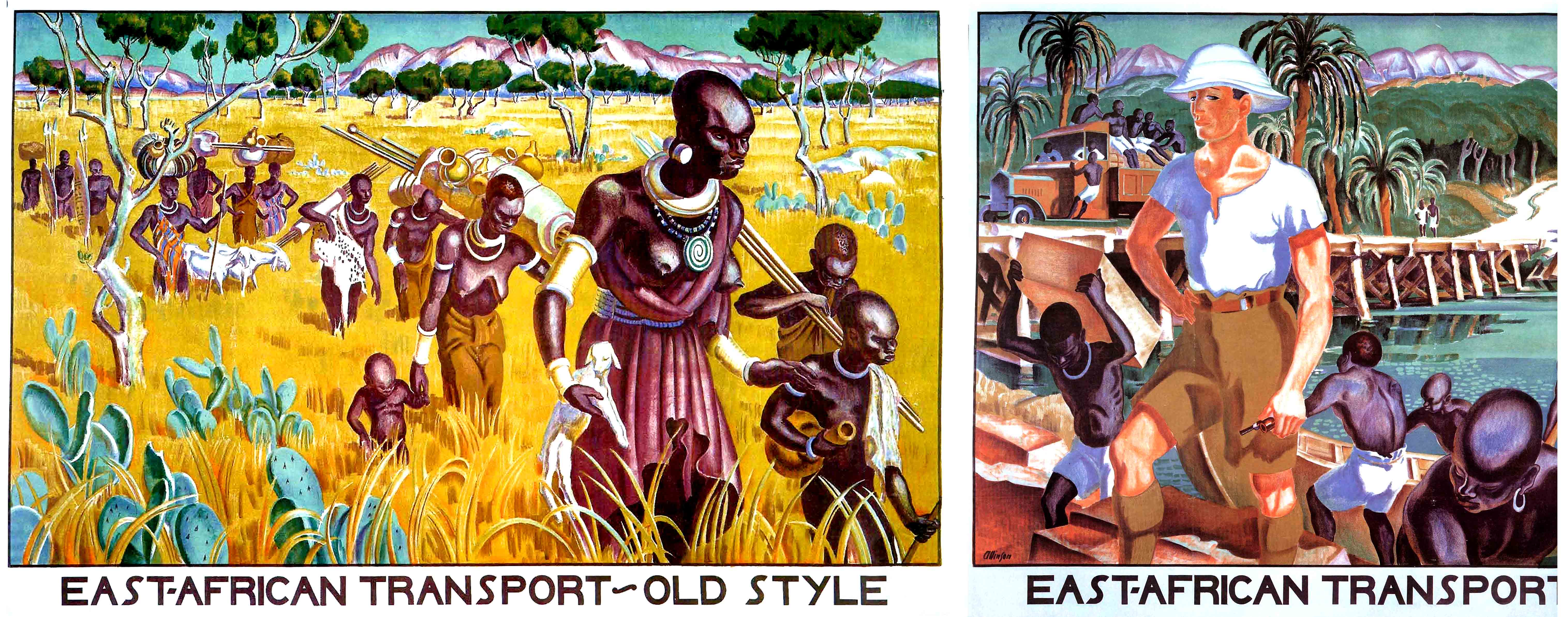
The style of these pieces is of art deco graphics, we know this by the type face and the style of the images, both depicting the effects of colonisation in Africa, the images where made in the early 1930's . It presents a time where the Empire Marketing Board was put into place to by the British government in 1926 and colonial empires made up a huge part of the economy, so when criticism arose around the moral and economic issues of this organisation, many artists where given the task of providing work that persuaded its citizens of the 'positive' effects of the empire in different ways, one of these being through this piece of art.
The first image labeled 'East African transport old style' shows a group of women and children wearing traditional clothing and traveling and carrying various items by foot through an African landscape, whereas the second image contrast with it, there are still african people doing manual labour but they aren't any women and children and rather men instead wearing shorts rather than the traditional clothing and the landscape is much more urban with the use of a boat whereas before it was much more rural, put together these show a much different scenery and its desgined to show the positive effects of western culture taking over various countries, we know this by the depiction of a whire man standing proudly above everyone else as to show him possibly guiding everyone to a 'better' future.
Bibliography:
Graphic Design: A new history
https://books.google.co.uk/books?id=Kmx6qBz_l68C&pg=PA179&lpg=PA179&dq=East+African+Transport+Old+Style%27+and+%27East+African+Transport+New+Style%27&source=bl&ots=yqBnDyIvsM&sig=fuCWdduVL_KxZDEIA1e4SseRV_c&hl=en&sa=X&ved=0CEIQ6AEwCGoVChMI4Izyn6GwyAIVgvMeCh3mwwBI#v=onepage&q=East%20African%20Transport%20Old%20Style'%20and%20'East%20African%20Transport%20New%20Style'&f=false
BA (Hons) Graphic Design & Illustration
What is visual literacy?
Visual literacy is being able to identify how and what an image communicates to the audience and what different questions we should ask to fully gain an understanding of the meaning.
Images and Questions:
Comparison between Uncle Sam Range and East Africa Transport Old Style' and 'East African Transport New Style
The Uncle Sam Range (1876) Advertising Image by Schumacher & Ettlinger, New York
Empire Marketing Board - 'East Africa Transport Old Style' and 'East African Transport New Style' - Adrian Allison, from the 'Colonial Progress Brings Home Prosperity' Series of posters;
The thing that was most notable when I first looked at this image was how illustrative it is as piece of advertising/propaganda in comparison to what we might now.
Its evident that from the patriarchal colour choices of red white and blue and the western styled font that this piece was used to appeal to an american audience.
There are several pieces of evidence that suggest that this advert is intended to sell a cooker, we know this by the black man near the stove and people recieving the food and enjoying it, the words 'feeding the world in the aid of' suggest that they are trying to provide food for everyone and be seen as a positive force. I think the image is obviously quite materialistic because of this. The most profitable audience for materialistic items isn't specific to a certain class, however with the people of power and the amount of wealth suggested in the image it might be trying to appeal to people in the working class and possibly admiring the lifestyle and emulating wealth making them want to buy the product.
Although this image was seen as a positive marketing scheme for the time, I can't help but feel it has an exploitive feel to it, with the use of stereotypes on the long list of items, the black man (very likely a slave) is over the stove preparing the food for everyone and yet the stove is meant to be the product that is being sold, this could possibly show the normality of slavery at the time and the lack of progression in society around race. Another detail that is interesting to question is the role of gender, we can see a woman serving the people gathered around the table also showing another aspect of society that was different to what it is now and also gives us an insight to how progressive the times were.
The cartoonish globe stands out against the rest of the images's style as the rest is quite serious looking and and illustrative, the globe looks like its smiling against towards the list of food while everyone looks fondly over to it as well, this presents the idea that this image is meant to positively viewed.


The style of these pieces is of art deco graphics, we know this by the type face and the style of the images, both depicting the effects of colonisation in Africa, the images where made in the early 1930's . It presents a time where the Empire Marketing Board was put into place to by the British government in 1926 and colonial empires made up a huge part of the economy, so when criticism arose around the moral and economic issues of this organisation, many artists where given the task of providing work that persuaded its citizens of the 'positive' effects of the empire in different ways, one of these being through this piece of art.
The first image labeled 'East African transport old style' shows a group of women and children wearing traditional clothing and traveling and carrying various items by foot through an African landscape, whereas the second image contrast with it, there are still african people doing manual labour but they aren't any women and children and rather men instead wearing shorts rather than the traditional clothing and the landscape is much more urban with the use of a boat whereas before it was much more rural, put together these show a much different scenery and its desgined to show the positive effects of western culture taking over various countries, we know this by the depiction of a whire man standing proudly above everyone else as to show him possibly guiding everyone to a 'better' future.
Bibliography:
Graphic Design: A new history
https://books.google.co.uk/books?id=Kmx6qBz_l68C&pg=PA179&lpg=PA179&dq=East+African+Transport+Old+Style%27+and+%27East+African+Transport+New+Style%27&source=bl&ots=yqBnDyIvsM&sig=fuCWdduVL_KxZDEIA1e4SseRV_c&hl=en&sa=X&ved=0CEIQ6AEwCGoVChMI4Izyn6GwyAIVgvMeCh3mwwBI#v=onepage&q=East%20African%20Transport%20Old%20Style'%20and%20'East%20African%20Transport%20New%20Style'&f=false
Tuesday, October 13, 2015
To kern or not to kern
I never quite knew the significance of kerning and how much it was actually able to communicate but also not really knowing the definition itself. I was able to understand the meaning and the importance of its use with a practical work activity,
(Below) these instances were times which was a bit more challenging than before as we had time to discuss whereas now we only had about thirty seconds.
 |
| Selection of letter we were given |
 |
| for a luxury car company,lots of spacing better shows lettering |
 |
| Condom company (closely put together to simulate intimacy, the letters are all at different angles which) |
 |
| Student club, not much space kept, ordered neatly show order or information, also a bit different from normal formation to possibly show a bit of a unique twist rather than being side by side |
 |
| this was done to portray a pest control company, showing the letters with quite a lot of space and the gradual levitation showing something being eradicated. |
Something I found really interesting to watch was a documentary called "Gentlemen of letters" which went into detail about the history of Dublin's signs, one thing that sticks to mind was someone in the documentary calling it a "snapshot of time" since a lot of the lettering still remains today; discussing the visual importance of the practice and its effect on the people of Dublin.
Having a glimpse into this practice was interesting as I'd previously never seen it in action or understood its importance before, something that was obvious is that there is a lot of precision within this work, when it came to talking about kerning it seemed like it was a big part of what made a sign successful and what didn't. Not being able to get rid of these letters so easily shows how much value they bring to a place and the work and planning that goes into them, this goes along with kerning as this is something that is heavily analysed when working by just your own eye.


Subscribe to:
Comments (Atom)


